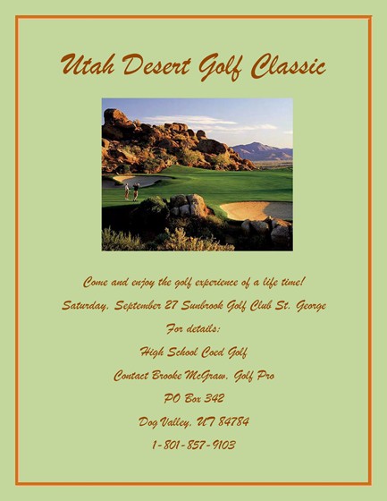
This is my first flyer that I had to make in my desktop publishing class. I will admitt that I didn't put much into it and I also don't know anything about CRAP. I first put a border around the page. I picked a rusty looking orange because it was the first color that popped in my head when I thought about a desert. Then i went on to Google to try and find a picture that would fit a Utah Desert Golf. After I copied and pasted the image I changed the page color to fit the picture. Lastly I added all of the information and detalis at the bottom of the page.
Comments: 1
Your flyer has very good contrast. The picture ties everything together, making the flyer more intersting to look at. I like how everything thing is aligned in the center, tying it together. It makes it look very oranized and easy to read. I think that the proximity of you flyer is very good. All of the words are not to far apart or to close together, and the words are not grouped with the picture, everything is organized very nicely, and nothing is scattered to fill up space. You did a very good job on repitition, the color and font repitition is the same thoughout, making it very visually interesting, and it unifies the whole flyer.
Your flyer has very good contrast. The picture ties everything together, making the flyer more intersting to look at. I like how everything thing is aligned in the center, tying it together. It makes it look very oranized and easy to read. I think that the proximity of you flyer is very good. All of the words are not to far apart or to close together, and the words are not grouped with the picture, everything is organized very nicely, and nothing is scattered to fill up space. You did a very good job on repitition, the color and font repitition is the same thoughout, making it very visually interesting, and it unifies the whole flyer.
1/9/2012 11:20 AMJosi Greif Reply